By Becky Arnold
I talk to a lot of clients about paint colors, whether they're settling into a new home or getting one ready to sell, and color psychology in home design comes up more than people expect. It's a genuinely useful framework, but it's worth knowing upfront that it blends real research with a lot of design tradition, and the two don't always agree as cleanly as a paint chip display makes it look. Here's how I think about it room by room.
Key Takeaways
- Color psychology in home design draws on real research, but it's still a mixed field, part science and part design tradition.
- Warm tones tend to suit social spaces, while cool tones tend to suit rooms meant for rest or focus.
- Cool colors that feel calming during the day can actually work against you at night, depending on the lighting.
- Light and dark values change how big or intimate a room feels, which matters a lot in smaller, cabin-style homes common around Tahoe City.
Start With What the Research Actually Shows
Color psychology gets treated as settled science in a lot of marketing copy, but the honest picture is more mixed. One of the more credible studies on the topic, a university residence hall study covering more than 400 students over an average of 13 months, found a genuine preference for blue interiors and a significant link between blue and a calmer mood, along with blue being seen as more conducive to studying. Differentiated colors in that same study also helped residents orient themselves and navigate a large building more easily. That's real, but it's also one study in one context, so I'd treat color psychology as a useful starting point for decisions, not a formula that guarantees a specific outcome.
What's Actually Supported by Research
- A documented preference for blue interiors and a link between blue and calmer mood in at least one large residential study
- Blue being associated with better focus in that same study
- Differentiated colors helping with wayfinding and orientation in larger buildings
- A field that blends genuine research with centuries of design tradition, so treat broad claims with some skepticism
- A meaningful gap between how confidently color psychology gets marketed and how much research actually backs any single claim
- Individual variation in how people respond to a given color, which no single study can fully capture
Choose Warm Tones for Rooms Built for Energy and Connection
Warm tones, reds, oranges, and yellows, are generally associated with energy, warmth, and social interaction, which makes them a common choice for living rooms, dining rooms, and kitchens where people gather. These colors read as more intense than cool tones, so they tend to work best as an accent wall or a smaller dose of color rather than covering every surface in a room. A muted or deeper version of a warm tone can capture the same effect without overwhelming a smaller space, which matters if you're working with a more compact floor plan.
Where Warm Tones Tend to Work Well
- Living rooms and dining rooms, where a warm tone can encourage conversation and gathering
- Kitchens, especially as an accent rather than a full wall-to-wall treatment
- Entryways, where a warm welcome matters before guests move further into the home
- Smaller doses or accent walls rather than saturating an entire room, especially in tighter spaces
- Deeper, muted versions of a warm tone if you want the effect without an overly bold look
- Pairing a warm wall color with warm-toned wood or metal finishes to keep the palette cohesive
Choose Cool Tones for Rooms Built for Rest
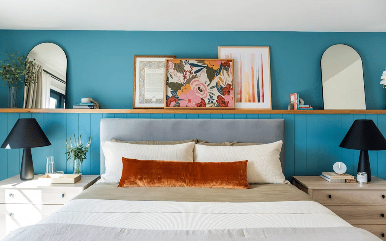
Cool tones, blues, greens, and purples, are generally associated with calm and relaxation, which is why they show up so often in bedrooms, bathrooms, and home offices. Cool colors also tend to make a space feel visually larger and more open, which is worth knowing if you're working with a smaller room. Given the research on blue specifically, it's a reasonable choice for a bedroom or a home office where focus and calm both matter, though the effect is subtle rather than dramatic.
Where Cool Tones Tend to Work Well
- Bedrooms, where calm and rest are the goal
- Bathrooms, where a cooler palette often reads as clean and soothing
- Home offices, where blue in particular has been linked to better focus
- Smaller rooms generally, since cool tones can help a space feel more open
- Rooms with limited natural light, where a cool tone can feel fresher rather than dim
- Spaces where you want a calmer backdrop for busier furniture or artwork
Know the Nighttime Caveat With Cool Colors
Here's where it gets more interesting than the typical color psychology article lets on. A 2025 study on interior color and circadian rhythm found that cool colors, despite being perceived as calming, can actually intensify circadian disruption at night. That happens because cool colors reflect more blue-toned light back into the room, and blue-heavy light in particular is what most strongly interferes with the body's internal clock after dark. That doesn't mean you need to repaint a cool-toned bedroom, but it's worth pairing a cool palette with warmer, lower-color-temperature lighting in the evening rather than assuming the wall color alone is doing the calming work.
What This Means for Your Lighting Choices
- Pairing cool-toned rooms with warmer, lower-color-temperature bulbs in the evening
- Not assuming a calming wall color offsets bright, blue-heavy overhead lighting at night
- Considering dimmable fixtures in bedrooms so you can shift the lighting mood without repainting
- Remembering that color and light work together, not as two separate decisions
- Choosing warmer bulbs for bedside and reading lamps specifically, since that's the light you're exposed to right before sleep
- Keeping screens and bright overhead lights to a minimum in the hour before bed, regardless of wall color
Use Light and Dark Values to Shape How a Room Feels
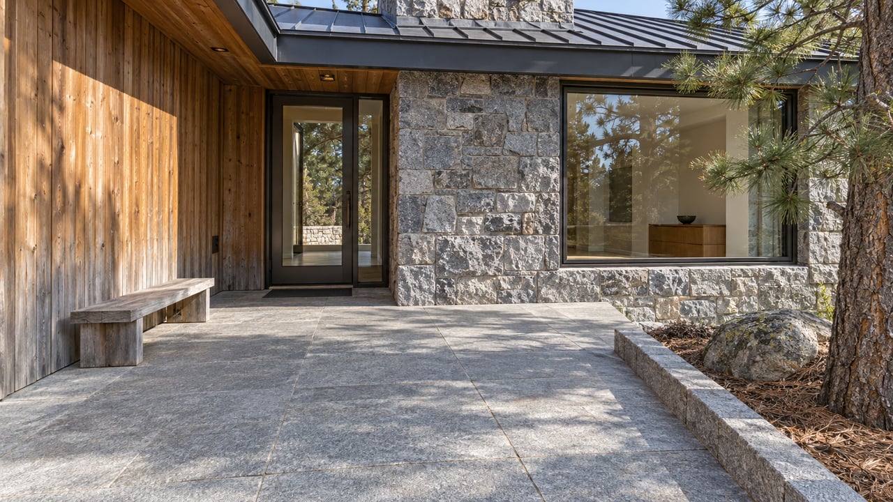
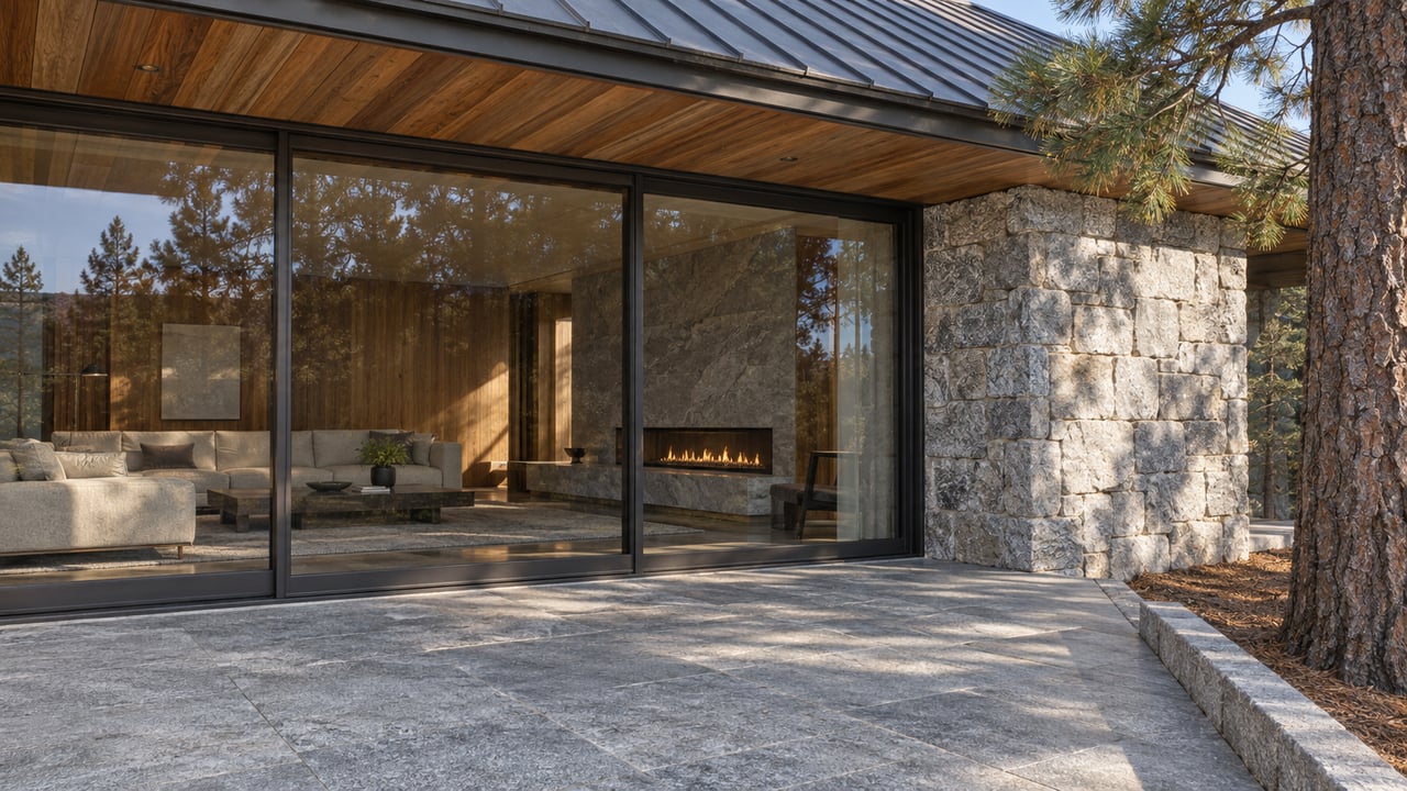
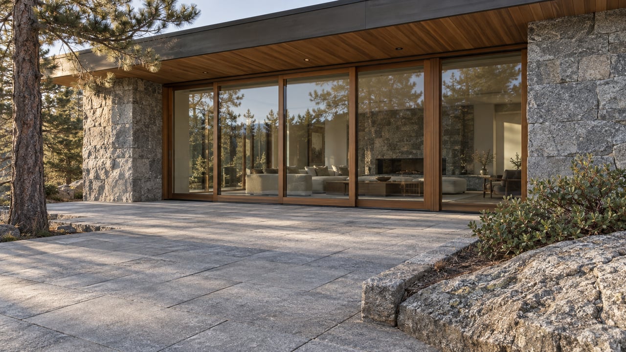
Beyond warm versus cool, how light or dark a color reads matters just as much, especially in smaller, cabin-style homes common around Tahoe City. Lighter values tend to expand a room visually, which helps in tighter floor plans, while darker values create a more intimate, cozy feel that can work well in a den or a room meant for winding down. Texture and lighting also change how any given color actually reads through the day, so it's worth looking at a paint sample in the room's actual light before committing, since a color that looks right at noon can read very differently under evening lamplight.
How Light and Dark Values Change a Room
- Lighter values for smaller rooms where you want an open, airier feel
- Darker values for spaces meant to feel cozy and intimate, like a den or reading nook
- Testing paint samples in the room's actual daylight and evening lighting before committing
- Accounting for texture, since matte and glossy finishes reflect color differently
- Considering how a room's function changes through the day, since a home office and a reading nook can call for different values even in the same room
- Using darker values on a single accent wall if you want intimacy without darkening an entire room
FAQs
Is color psychology backed by real science or mostly design tradition?
It's genuinely a mix. There's real research behind some color associations, like the link between blue and calm mood, but a lot of what gets presented as settled science is really design tradition dressed up with confident language.
What color makes a small room feel bigger?
Lighter, cooler tones generally read as more expansive, which is useful in smaller floor plans. Pairing a lighter wall color with good natural light amplifies the effect even more.
Does color choice actually matter for selling a home?
It can, especially with neutral, well-lit spaces that let buyers picture their own belongings in a room. I'm always happy to talk through what makes sense for a specific property before you list.
Contact Becky Arnold Today
Whether you're choosing paint for a home you just bought or getting one ready to list, I like helping clients think through what actually works for a space rather than just what's trending. If you want a second opinion on colors before you commit, I'm happy to weigh in.
Reach out to me,
Becky Arnold, and let's talk through what would work best for your home.